5 Wellness Brands With Visual Identities Worth Studying
Date:

Wellness brand identity inspiration for founders is everywhere online — mood boards, Pinterest dumps, Canva templates — but most of it teaches you what's trending, not what's working. There's a difference. Trendy brands might look the part for a little while. Strategically designed brands build lasting businesses.
Below are five wellness brands whose visual identities go beyond aesthetics. Each one was built with a clear point of view, and every design decision — the typography, the color palette, the packaging, the website — reflects something true about the founder, the product, and the customer they're speaking to. That's the standard to aim for.
Therapy Notebooks


Therapy Notebooks is a masterclass in using visual restraint to build trust. Founded by a team of clinical psychologists, designers, and writers, the brand makes evidence-based mental health tools in the form of guided journals — and its identity communicates exactly what a potential customer in a vulnerable moment needs to feel: calm, credible, and safe.
The design system is clean and considered without being cold. Covers are minimal — a soft, muted color field, a clear product name in a well-chosen serif, and a discreet, structured layout that signals expertise rather than whimsy. There's no clutter, no illustration, no decorative noise. The restraint is the message: these tools are serious, they work, and they won't overwhelm you. The typography is warm but precise, and the muted color palette — soft grays, dusty roses, warm creams — creates a visual consistency across the product line that feels like a cohesive prescription rather than a random shelf of journals.
There's something deeper at work in the design that's worth naming: Therapy Notebooks brings dignity to moments that are often stigmatized. Anxiety, depression, insomnia, trauma — these are experiences people frequently feel shame around, and many of the products designed to address them are clinical to the point of coldness or cheerful to the point of dismissiveness. Therapy Notebooks finds the exact middle ground. The design says this is a real thing you are going through and you deserve a beautiful, well-made tool to help you through it. That's not a small thing. Putting a thoughtfully designed object in someone's hands — something they'd be comfortable leaving on their nightstand — is a way of normalizing the experience of struggling without minimizing it.
The lesson for wellness founders is about the relationship between design and trust. For brands operating in the mental health space, the identity has to do emotional labor before the customer ever opens a product. Every design decision — the weight of the font, the amount of white space, the choice to avoid playful illustration — signals to the customer that this brand understands the seriousness of what they're going through. Therapy Notebooks proves that in wellness branding, simplicity and intention are not the same thing as minimalism for its own sake.
The Hoodwitch


The Hoodwitch is one of the most distinctive visual identities in the spiritual wellness space, and a lot of that power comes from what it refuses to do. In a category full of soft and fluid The Hoodwitch sets it on fire. It’s shadowy, dark feminine energy. The site opens on a mysterious, animated background with a centered logo that feels as if you've arrived somewhere, not just clicked a link.
The typographic choices are deliberate and bold: display type that carries weight and intention, used sparingly against dark backgrounds so each word lands. The imagery throughout the brand is cinematic rather than commercial. This isn't a wellness brand trying to soothe anxious buyers. It's a brand that trusts its audience to come to it.
For founders, The Hoodwitch illustrates one of the most important principles in wellness brand identity: know exactly who you are not designing for. The dark aesthetics might alienate some people — and that's the point. The clarity of the identity acts as a filter, drawing in a community of deeply aligned customers who feel seen and reflected in the visual world the brand has built. A polarizing brand is often a strong brand.
Nopalera


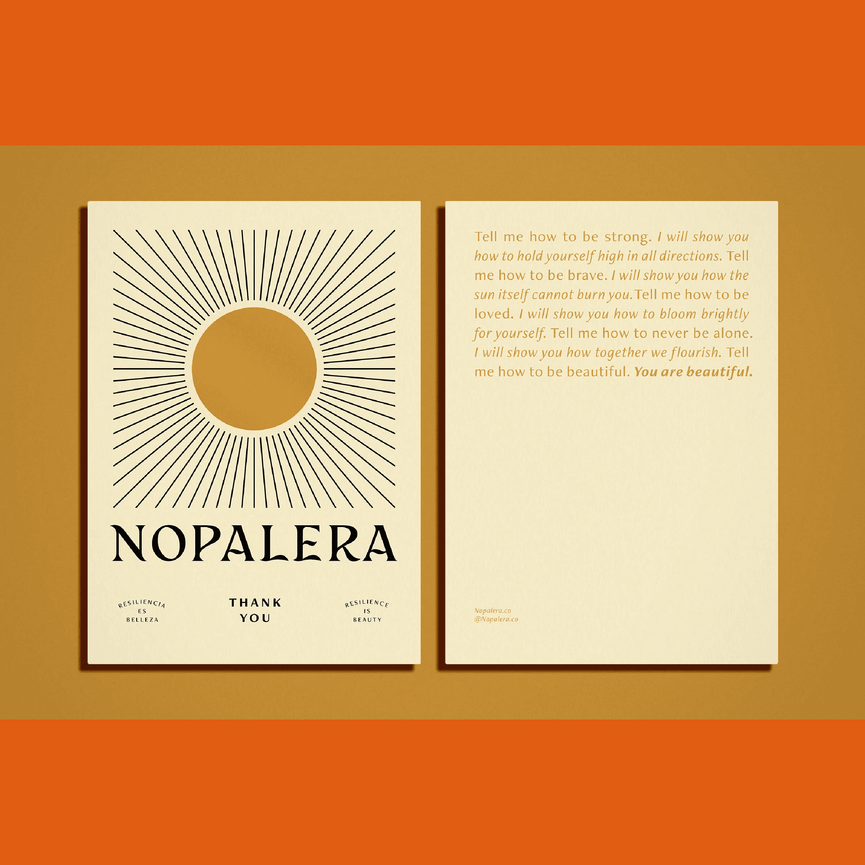
Sandra Velasquez spent a full year developing Nopalera's brand identity before launching a single product. That investment shows. Nopalera is a modern Mexican bath and body brand built on the nopal cactus, and its visual identity was designed with a singular mission: to make Latino culture aspirational in a beauty industry that had long overlooked it. The result is one of the most intentional color stories in wellness branding.
Nopalera's palette is vivid and saturated, colors that feel celebratory rather than calming. This is a deliberate contrast to the beige-and-sage minimalism that dominates the clean beauty space. The logo illustration deserves its own moment. It depicts a face rendered in a style that looks carved. Cactus paddles form the figure's hair, making the wordmark and the icon one unified idea. Radiating lines extend outward from the illustration, which flex depending on the application. On some packaging they extend to fill and echo the shape of the box itself; on others they pull back to form a tight halo around the mark. The illustration stays fixed, but the energy around it breathes. That kind of adaptable brand element — one anchor with a flexible expression system — is rare and difficult to execute well. Nopalera does it seamlessly.
What wellness founders can take from Nopalera is this: if your brand is rooted in a specific cultural identity, lean into it completely rather than sanitizing it for a broader audience. The brands that try to appeal to everyone often connect deeply with no one. Nopalera's specificity is its strength, and the visual identity is the primary vehicle for communicating that specificity at every touchpoint.
Anima Mundi Herbals


Founded by herbalist Adriana Ayales, who grew up in Costa Rica and trained under rainforest medicine traditions, Anima Mundi Herbals has one of the most visually coherent identities in the botanical wellness space. The name itself — Latin for "soul of the world" — sets the tone immediately.
The packaging is where the identity truly lives. Amber glass bottles, dense hand-illustrated plant and celestial motifs, and a mix of serif elegance with ornamental frames and embellishments. Each product feels like an artifact — something discovered rather than manufactured. The color palette is earthy and dreamy, all woody browns, leafy greens, and moody violet tones that keep the brand grounded even leaning esoteric. There's no digital brightness here. Everything feels analog and time-worn in the best possible sense.
The lesson for wellness founders: your packaging is a physical extension of your brand world. If your product philosophy is rooted in ancestral tradition, wildcrafted ingredients, and ritual practice, your design system should feel like it belongs to that world. Anima Mundi doesn't just sell herbal supplements — the identity makes the customer feel they are participating in something ancient and alive.
La Boticá Studios


La Boticá Studios is a fragrance house founded by Dawn Marie West, an art director and fine art photographer of Afro-Dominican heritage. The identity is deep-toned and architectural: a wordmark logo in clean, caps that signals quiet luxury, set against rich, shadowy photography that reads more like a fashion editorial than a beauty brand.
What makes La Boticá's identity so effective is restraint in service of depth. The palette — dark neutrals, warm blacks, the occasional flush of amber — never competes with the story. The photography does the heavy lifting, drawing on the light and texture and the intimacy of atelier-style production shots. For wellness founders, the lesson here is that your identity doesn't need to shout to command attention. When the craft is real, a soft confidence in your design system is powerful.
Summary
Therapy Notebooks → clinical minimalism with warmth
Anima Mundi → packaging as ritual artifact + illustration as world-building
The Hoodwitch → polarizing identity as a strength
Nopalera → cultural pride as vibrancy
La Boticá → restraint + editorial photography
Author:
Anastasia Salazar
Salazar is a creative studio specializing in branding and web design for health and wellness. Reach out to learn more.


