4 Wellness Brand Websites That Get It Right
Date:
Author:
Anastasia Salazar
If you're building a wellness brand, or about to brief a designer on your website, the best education is looking closely at what's already working. Not to copy it, but to understand why it works: what makes a first-time visitor trust a brand they've never heard of, what makes a product page actually convert, what makes someone stick around.
For this roundup I looked at four wellness brands through five lenses: layout, brand, content, ease of use, and moments of delight. A few are polished and established. A couple are scrappier, and arguably more interesting for it. All four have something founders can draw inspiration from.
The Pelvic People


The Pelvic People make clinician-designed tools for painful sex, a category that lives or dies on trust, discretion, and not feeling clinical in the cold, sterile sense. Their site earns that trust in a few smart ways.
A guided quiz routes visitors to the right product, which matters more here than in most ecommerce categories. These are innovative, sometimes unfamiliar products, and a quiz does the education and the merchandising in one move. The brand also leans hard into its origin story: started in a kitchen, now clinician-trusted and recommended. The "kitchen table to clinical credibility" arc builds trust fast, and it's reinforced by a dedicated clinician page with downloadable info kits, a smart move for a product that needs professional buy-in, not just consumer interest.
Design-wise, the sitemap is simple, but there's sophistication in the details: a parallax carousel scroll, and an ownable icon set used across product pages to communicate benefits and features at a glance. It's not perfect; the quiz's background image gets cut off in a way that reads unfinished, and Shopify's default cart and account icons peek through here and there. But those small tells aren't necessarily a liability. For a brand like this, a little "not-a-big-corporation" texture can actually build trust rather than undercut it. The mobile experience holds up just as well as desktop, which, for a brand this considered, is table stakes, not a bonus.
HUMANN


HUMANN sells plant-based supplements for cardiovascular health, in a category where everyone claims to be "science-backed." What sets them apart is how far they go to prove it: a 18-year origin timeline that starts with a Nobel Prize, laying out the actual research lineage behind the product instead of just asserting credibility.
The "Our Story" page is genuinely well-designed and does the trust-building heavy lifting. However, a "buy 2 get 1 free, as-seen-on-TV" message elsewhere undercuts that same trust rather than reinforcing it. It's a good example of what happens when a site is built in phases: the evergreen pages feel agency-designed and intentional, while newer additions like the homepage banner feel updated for a promotion without the same design attention.
Where HUMANN really delivers is product findability. A "shop by health benefit" entry point, plus filters by format (chewable, powder, capsule) is both genuinely useful and an elegant way to communicate the full breadth of the product line without a wall of text. If there's a gap, it's the human element: heavy on trust and authority, light on the emotional.
Behave Candy


Behave sells low-sugar gummies, and their site is proof that a strong concept ages well. Bouncy gummy bear cutouts, an interactive footer game, and bright, joyful imagery throughout. This is maximalist without being chaotic.
The layout leans into big, chunky sections, and it works especially well right now: in a genuinely overstimulating internet, large sections with room to breathe read less like restraint and more like relief. An animated comparison table lets you stack Behave against competitors without leaving the page, a small feature that does real conversion work while staying entirely on-brand and fun.
It's a good reminder that "delight" doesn't have to mean subtle. Sometimes it means gummy bears jumping around a footer game.
Minor Figures


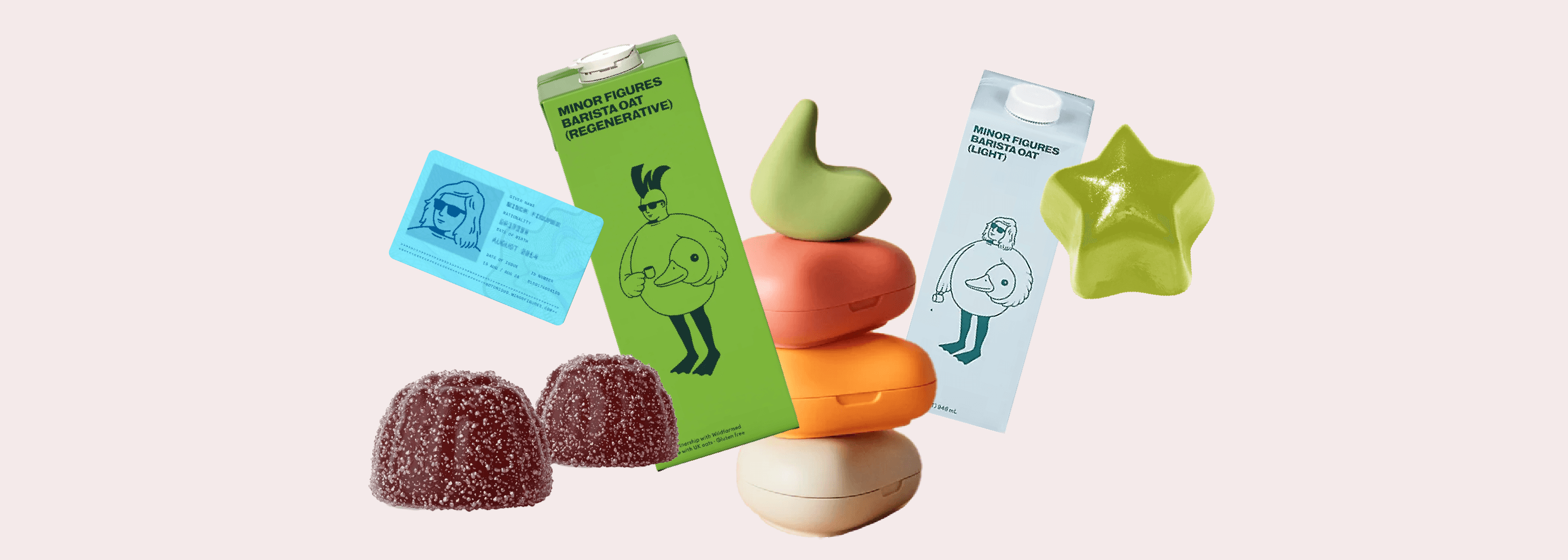
Minor Figures, best known for oat milk, feels less like a website and more like a hangout. One of their three total pages is a radio. Not a blog, not a playlist widget, a radio, and reason enough to come back on its own.
The design leans into coffee culture, or really into the people of coffee culture, with a minimal, almost anti-design sensibility that still has real whimsy in it. That kind of restraint takes more discipline than it looks like. The homepage closes with three embedded computer games. It's a bold bet: three total pages, no product-heavy navigation, and yet a stronger sense of brand identity than most sites with ten times the page count.
What's easy to miss under all that whimsy is how much substance is backing it up. Minor Figures publishes an annual B Corp impact report, and it's worth a look if you want to see mission-driven branding actually followed through with numbers: certified B Corp since March 2022, a carbon-neutral supply chain built on measured emissions rather than vague claims, and offset investment in reforestation and clean-energy projects from Nicaragua to Vietnam. It's a good model for any founder building a values-led brand — the playful front end works precisely because there's a documented, credible operation behind it, not in spite of it.
It's the outlier in this list, and worth including for that reason. Proof that a wellness-adjacent brand doesn't have to look or behave like a wellness brand to be effective. Sometimes the fewer the pages, the stronger the point of view.
What This Means for Your Site
Across all four, the through-line isn't polish, it's specificity. The Pelvic People's quiz, HUMANN's timeline, Behave's footer game, Minor Figures' radio: none of these are default template features. Each one exists because it solves a real trust or usability problem specific to that brand.
If you're a founder starting from scratch, that's the actual takeaway: don't ask "what does a wellness website look like." Ask what your customer needs to believe before they'll buy from you, and design one moment on your site that proves it.
Salazar is a creative studio specializing in branding and web design for health and wellness. Reach out to learn more.