From medieval scribes to el barrio: the blackletter lineage in Chicano identity
Date:
Author:
Dawn Salazar

Typefaces don’t just communicate words, they communicate a feeling.
Blackletter typefaces have a heaviness to them, a history. They feel formal and rebellious at the same time. And the more I learned about how these letterforms became part of Chicano culture, the more I began to understand why they caught my attention. Maybe it is because, in some strange way, I understand what it feels like to belong to something I didn’t completely grow up with. I didn’t grow up speaking Spanish, and I wasn’t surrounded by a strong Mexican culture. I was much darker-skinned than most of the people I grew up around and I didn’t always completely identify with the white culture surrounding me, but I also didn’t feel “Mexican” or “Indigenous,” because I hadn’t grown up immersed in those cultures. And yet, I knew there was something there. I am Chicanx (Definition: a female or male living in the U.S. of Mexican descent), and that history is part of my blood whether I grew up speaking Spanish or not and whether I was immersed in the culture or not. It’s a strange place to live; feeling a connection to something without always feeling like you have permission to claim it. And then you encounter people from that culture and something clicks. You see the faces, hear the language, recognize the food, the music, the artwork, the symbols and even though you may have been immersed in mostly white American culture your entire life, there can be this feeling of these are my people, and often they are willing to bring you in. That is part of why I became interested in the history of Chicano lettering.
So, what does Chicano mean? The word Chicano has a complicated history. The exact linguistic origin remains debated. What is less disputed is what happened to the word in the 20th century. “Chicano” was once commonly used as a derogatory term for Mexican Americans. During the Chicano Movement of the 1960s and 1970s, Mexican Americans reclaimed the word as an identity connected to cultural pride, political consciousness, Mexican heritage and, for many, Indigenous roots. That distinction is important. “Mexican American” can describe nationality or ancestry. “Chicano” became a cultural identity. For me, the word is interesting because it describes something I have struggled to put into words: what happens when you inherit a culture but don’t necessarily grow up inside it. I have this desire to embrace my heritage. I think a lot of people experience this. You can be surrounded by one culture while carrying another culture in your family history. Sometimes you feel like you don’t belong completely to either one. But maybe belonging isn’t always about what you were taught. Maybe some of it is what you inherit.
So What Does This Have To Do With Typefaces?


Typefaces carry history.
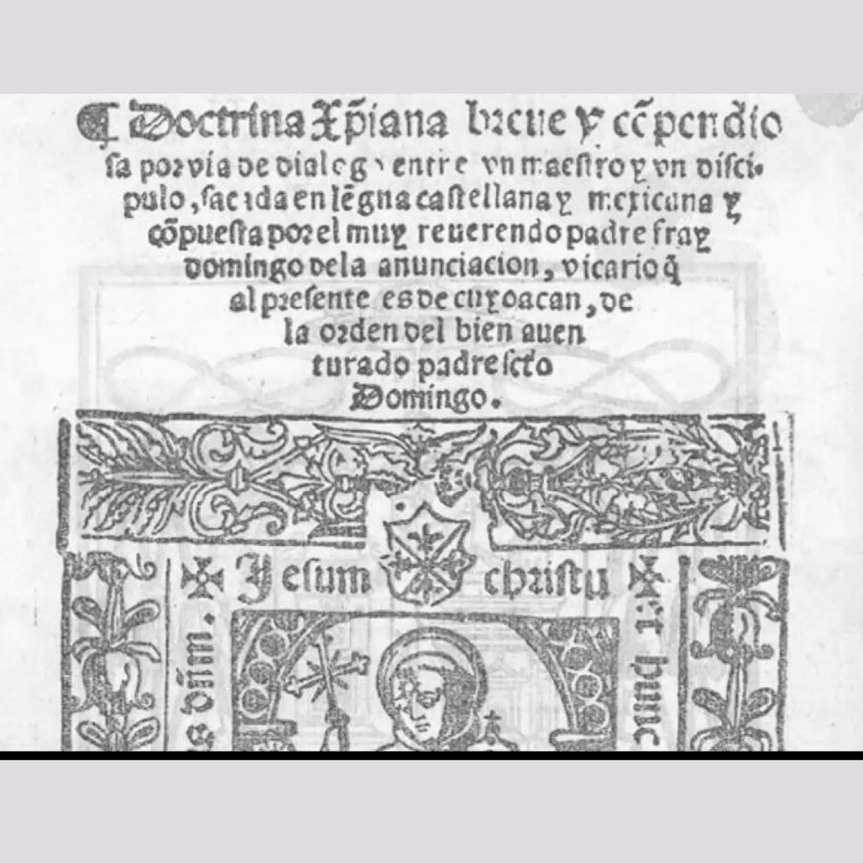
The blackletter family began in medieval Europe, developing from the dense, angular handwriting used by scribes beginning around the 12th century. These letterforms became closely associated with religious manuscripts and eventually with early European printing. Gutenberg’s famous Bible, printed in the 1450s, used a form of blackletter. In the early 1500s, the Spanish brought these printings to Mexico. The first printing press in Mexico made Catholic religious books. Blackletter was heavily utilized in their religious manuscripts, prayer books and church documents, where its dense, formal appearance gave the text a sense of sacred importance, tradition and authority. Centuries later, versions of these dramatic letterforms became standard for newspapers, institutions, and official documents representing formal authority. Ultimately, Mexican and Mexican American communities in the United States reinterpreted this European visual language, transforming blackletter into a powerful symbol of Chicano identity, street art, and cultural pride. They reclaimed the exact script institutions had enforced on them.
From Pachucos to Placas


In the 1930s and 1940s, the Chicano youth started the Pachuco Movement in places like Los Angeles and El Paso by developing a distinctive cultural identity. The zoot suit, Caló language (a mix of Spanish and English), music, attitude and visual style all became ways of declaring identity in a society that often treated Mexican American youth as outsiders. The style was not simply fashion; it was a visible statement of pride, resistance and belonging created by a marginalized community. Lettering became part of that visual identity. The placa, a distinctive name or street inscription could identify a person, neighborhood or sense of belonging.
Think about what a logo does today, it says, this is who we are. A placa could do the same thing only it wasn’t printed on a business card. It might be on a wall or a tattoo. The lettering became identity. The style was later transformed again inside California prisons. With limited tools and materials, incarcerated Chicano artists developed the fine-line, black-and-gray tattoo style that would eventually become internationally recognized. Artists such as Freddy Negrete helped pioneer this approach, while artists such as Mister Cartoon later carried elements of Chicano tattoo, lowrider and graffiti culture into mainstream music and fashion. Suddenly the visual language that had grown in marginalized communities was appearing on musicians, album covers, clothing and eventually high fashion.
The typefaces had traveled.

Why Blackletter?
Why these letters? Because blackletter already carried a sense of importance and permanence. These were letters associated with books, religion, institutions and things that were supposed to last. When Chicano artists transformed them, the meaning changed. The letters could now say: I am here. This is my neighborhood. This is my name. This is my culture. I belong.
And maybe that is why the typography feels so powerful. It isn’t simply a typeface, it’s a declaration. There's something about inheriting a letterform. It makes me think about how strange cultural inheritance can be. You don’t have to speak the language to inherit the history. and you don’t have to grow up surrounded by the culture to feel something when you encounter it. Sometimes you walk into a place where people look a little more like you. You hear a language you don’t speak or see a tattoo, a lowrider, a mural, a Virgen de Guadalupe, a name written in elaborate blackletter.
And something inside you says, I know this. Maybe that is what makes typography so powerful. A letter can carry a history that you never learned in school. It can survive assimilation, it can cross borders, it can move from medieval manuscripts to the Gutenberg Bible, from Catholic religious texts to Los Angeles neighborhoods, from prison tattoos to album covers, and onto a fashion runway.
It’s a stamp of resistance and a visual language that survives and says with its ornate first letter, it’s dark, and complex strokes, we have a history, an identity, we belong here. That’s the real beauty of Chicano typography. It took something that came from somewhere else and made it say something new. And for people like me, who have sometimes felt caught between cultures, there’s something comforting when you see the letters and somehow they feel a little like home.
Salazar is a creative studio specializing in branding and web design for health and wellness. Reach out to learn more.